Trusted AI Pricing Across 420 Fuel Stations
How I researched a pricing manager's day and designed an AI tool they could trust, override, and run the whole portfolio from — shipped as a coded prototype.
Through In Time Tec, I joined a national fuel retailer in the Netherlands as the UX lead — on the ground with the client while the engineering team built from India. The business sets prices for 420 stations every day, run almost entirely out of spreadsheets. I led the design from first user contact to an approved proof of concept, now being grown into an enterprise product.
Pricing 420 Stations a Day, From One Person and a Spreadsheet
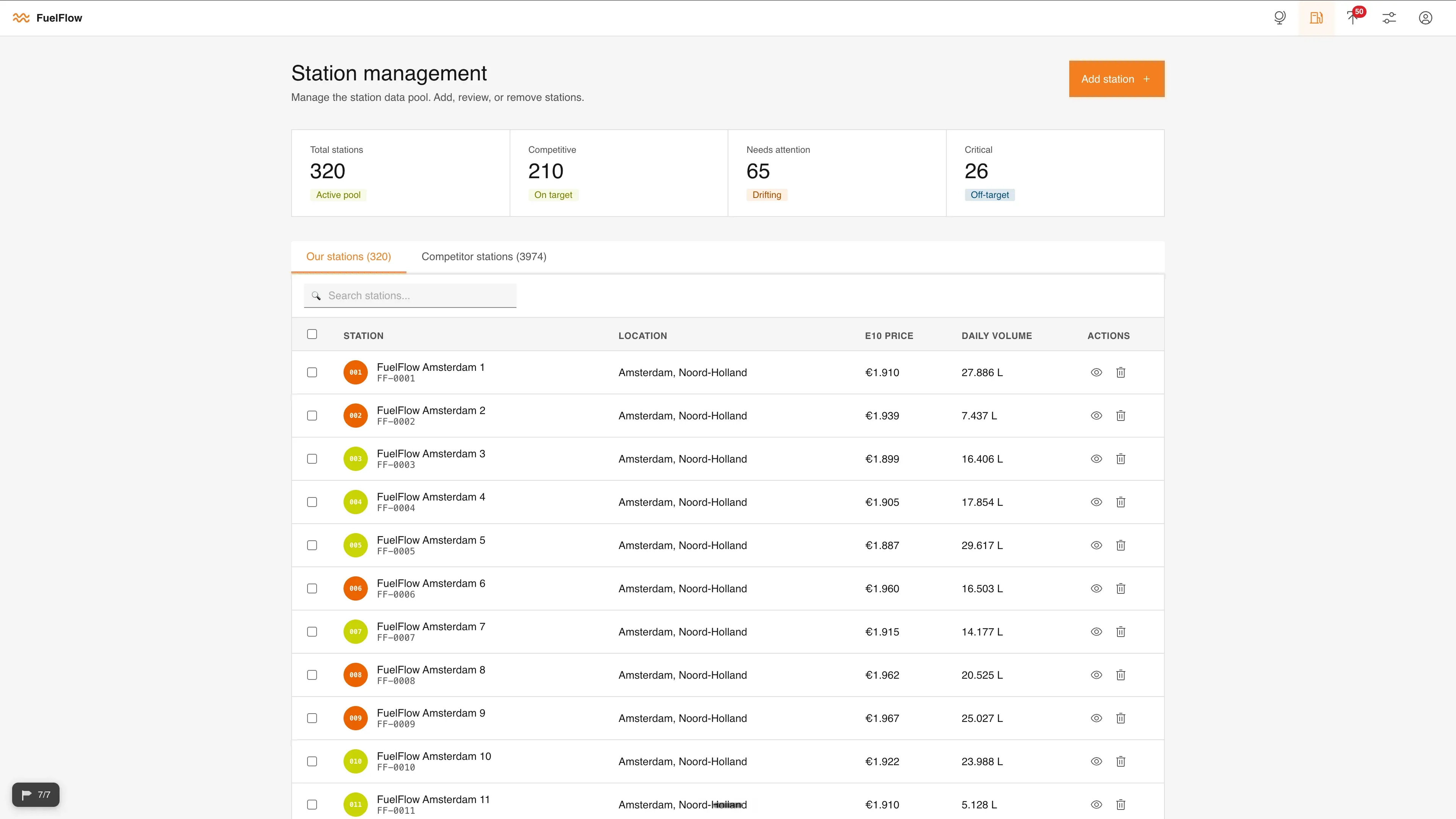
Every morning, one manager read competitor prices, yesterday's prices, and how each station sold — worked out a price, typed it into a sheet, and emailed it on. With 420 stations to clear, many sat unreviewed for hours. The tool I had to build needed to hold three things at once:
It had to give a clear overview.
One person needed to take in the whole portfolio at a glance and see which stations needed them first.
It had to price fast, station by station.
Each station is unique, so the manager needed to set every price individually — quickly, without the spreadsheet's fragility.
It had to be trustable.
The AI could only speed things up if the manager trusted it enough to act, while always staying in control of the final price.
Research Insights: Understanding the Pricing Manager's Day
Working from a design-thinking double diamond, I ran a diary study, an hour-long semi-structured interview, a validated journey-map workshop, and a MoSCoW prioritisation with the user — then cross-checked it with the senior pricing lead. A few pains were worth designing against:
Decisions Are Manual and Experience-Driven
Pricing lived in one person's head. “A lot of it is just experience — you kind of know what works for which station.” Strong opportunity to cut mental overhead and standardise decision quality.
The Market Is Uneven
Changes are frequent but uneven — not every station needs the same attention, and there was no fast way to see which ones did.
No Big Picture
The day-to-day ate all the time, so portfolio-wide visibility stayed shallow and patterns got spotted too late.
A Fragile Workflow
Excel was error-prone, approval and execution were split apart, and cut-off times drove everything.
Making the Right Choice for the Core View
With the research synthesised, the team ran an ideation session. The real question was how the manager would take in 420 stations and know where to look first.
Iterating From Concept to a Live, Coded Prototype
Before anything I built the design system — I shortlisted three and the client's team chose IBM Carbon, so the tool took shape in a style they owned. Then, instead of Figma, I gave Claude Code full context and orchestrated several instances in parallel to bring the concept to life as a real, interactive prototype.
Feedback Straight Back Into Live Code
I presented to the client and got specific, high-quality notes — putting competitors on the map among them. Because the prototype was live code, I took those changes straight to my agents and turned them around fast, then kept tightening it through one-on-ones with the manager and engineering Scrums.
 Wispr
Wispr Visual Studio Code
 Claude Code
The Tool: Researched, Built, Trusted
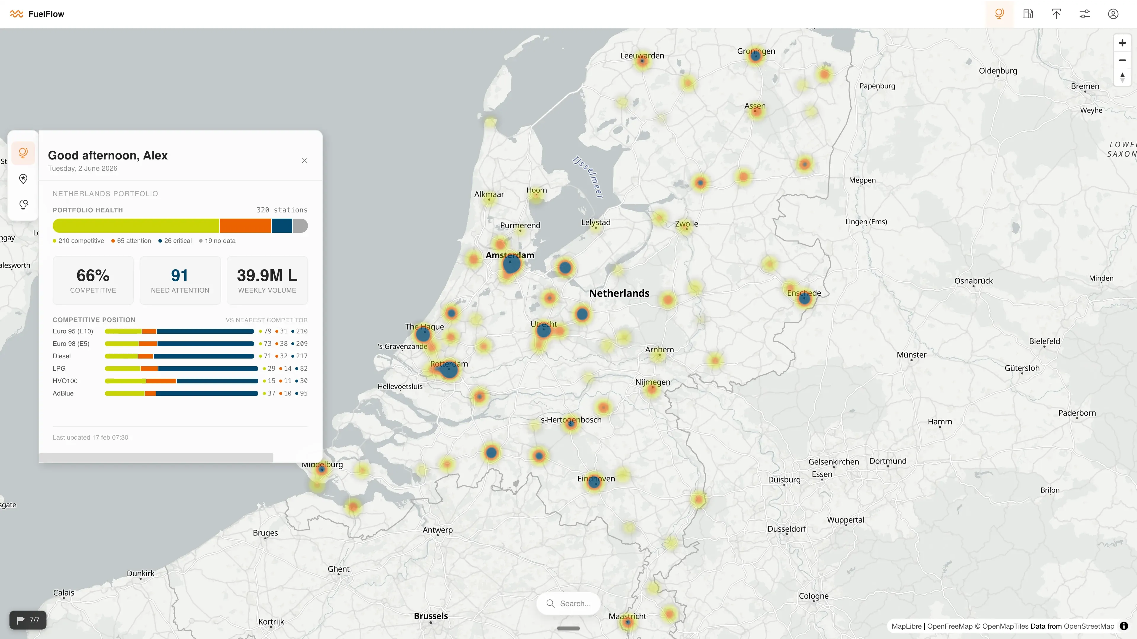
A navigable canvas — a map of the Netherlands with each station as a colour-coded dot, and movable widgets floating on top. Here's the anatomy:
The Map
Every station is a dot, colour-coded for urgency (a colour-blind-friendly palette the manager asked for, which happened to match the brand). The whole portfolio, readable in one glance.
Control Panel (3 Tabs)
Mirrors the manager's day: Overview of the whole portfolio, Priority to filter by urgency and work station-by-station, and AI Review with bulk upload.
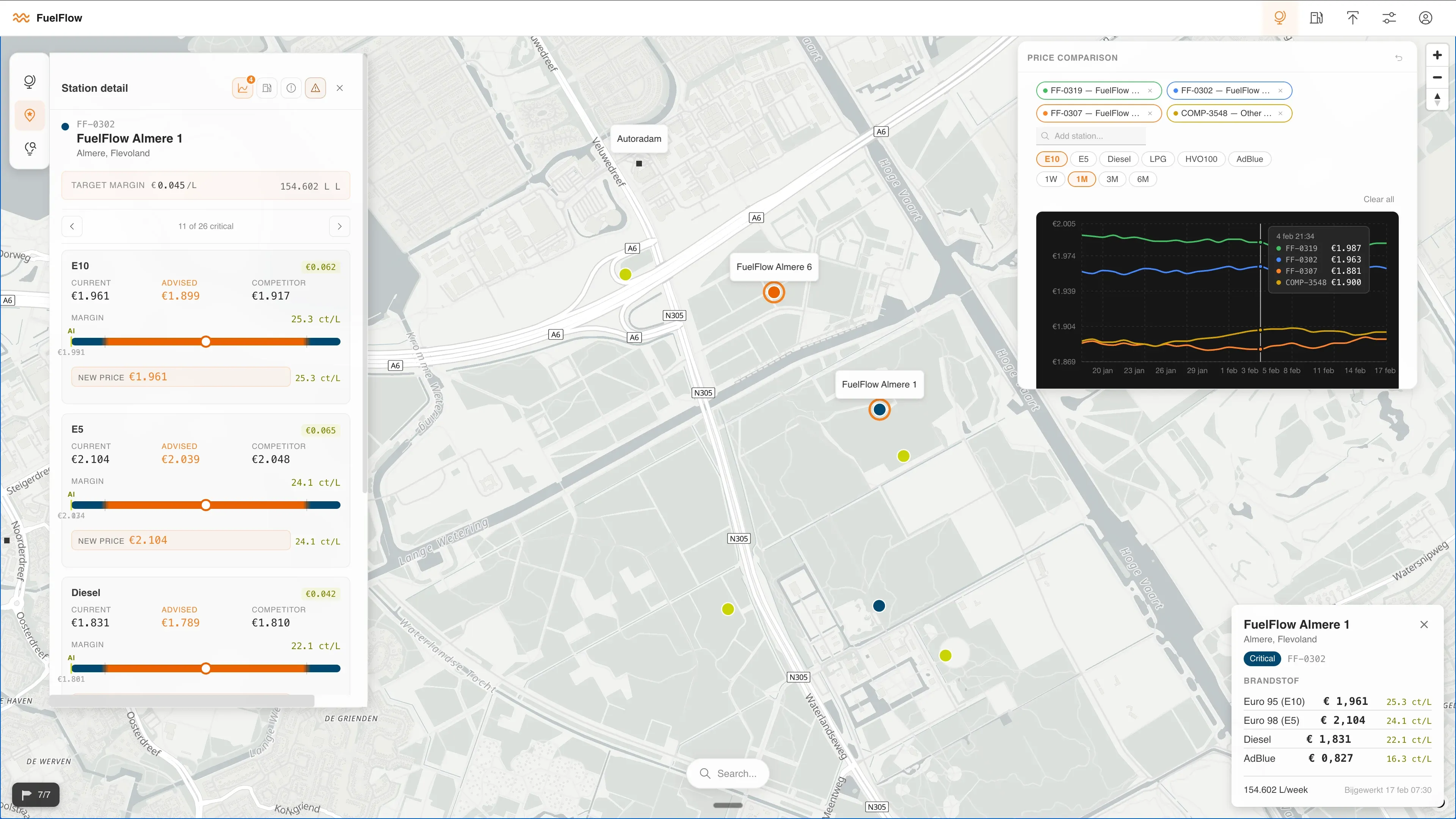
Station Detail Card
Select a station and a card opens where you set the price.
Price Dial
Pull the dial and watch the AI's suggested price and the live effect on margin move with it — or type the value by hand.
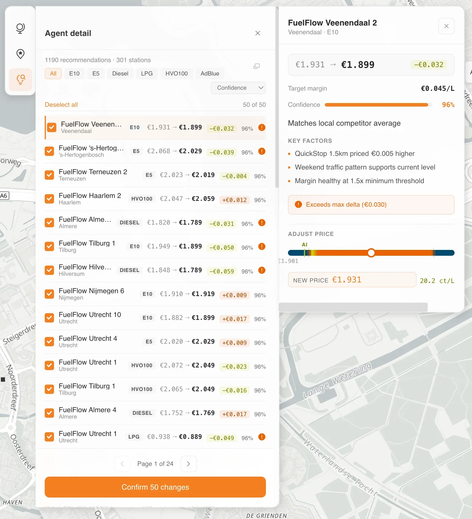
AI Justification + Confidence
Every suggested price carries a written reason and a confidence score out of 100, so the manager can act fast without second-guessing.
Guardrails (Hierarchy)
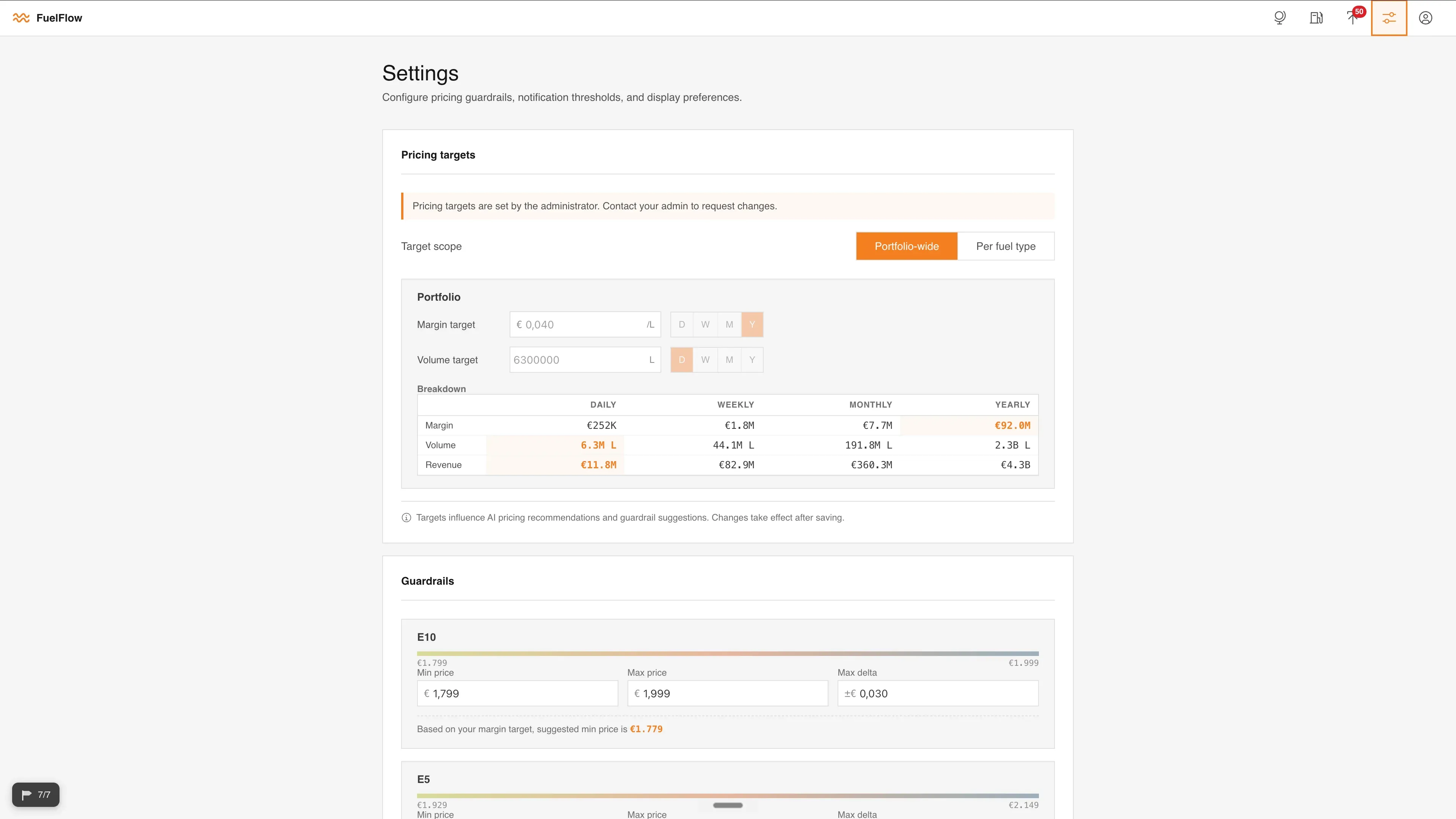
The senior lead sets the guardrails; the manager sees them read-only; they're fed to the model up front, so suggestions arrive already inside the agreed range.
Comparison Graph
Compare stations side by side against competitors — kept on the main canvas at the user's insistence, not pushed to a separate page.
Bulk Path + Second Review
Bulk upload ends in a deliberate second review — the one place I wanted to slow things down — so nothing goes out unconfirmed. The human always commits the price.
Refining Every Step of Pricing
I designed the flows around the moments that mattered — the dial and live-margin interaction, the AI-review and bulk-confirm path, the read-only guardrails — so trust and speed held up under real use.
In a usability test the proof of concept scored 85% — approved, and now being invested in as an enterprise-grade product to price the client's entire estate.
The manager can now get across all 420 stations in about an hour — work that used to take the better part of a week — covering more stations, more often, with the human in the loop the whole way.